Giving the blog a facelift
When I rewrote the blog in Rust I tried not to touch any of the styling, but some things annoyed me:
- It wasn’t pretty (even ugly in some parts).
- No dark mode support.
- Some elements were broken, for instance images or code blocks overlapping the header when it was floating to the side.
- I wanted to promote my series and projects more.
A better landing page

My thinking when I last updated the style was to keep things as simple as possible. I think I mostly succeeded with that, but I really don’t think the landing page was pretty.
So this time I wanted to:
- Make it prettier
- Spotlight posts, series and projects
As it happens I had remade the archive, projects and series pages already, and it just fell out well to simply include some partial contents and shove them into the homepage.
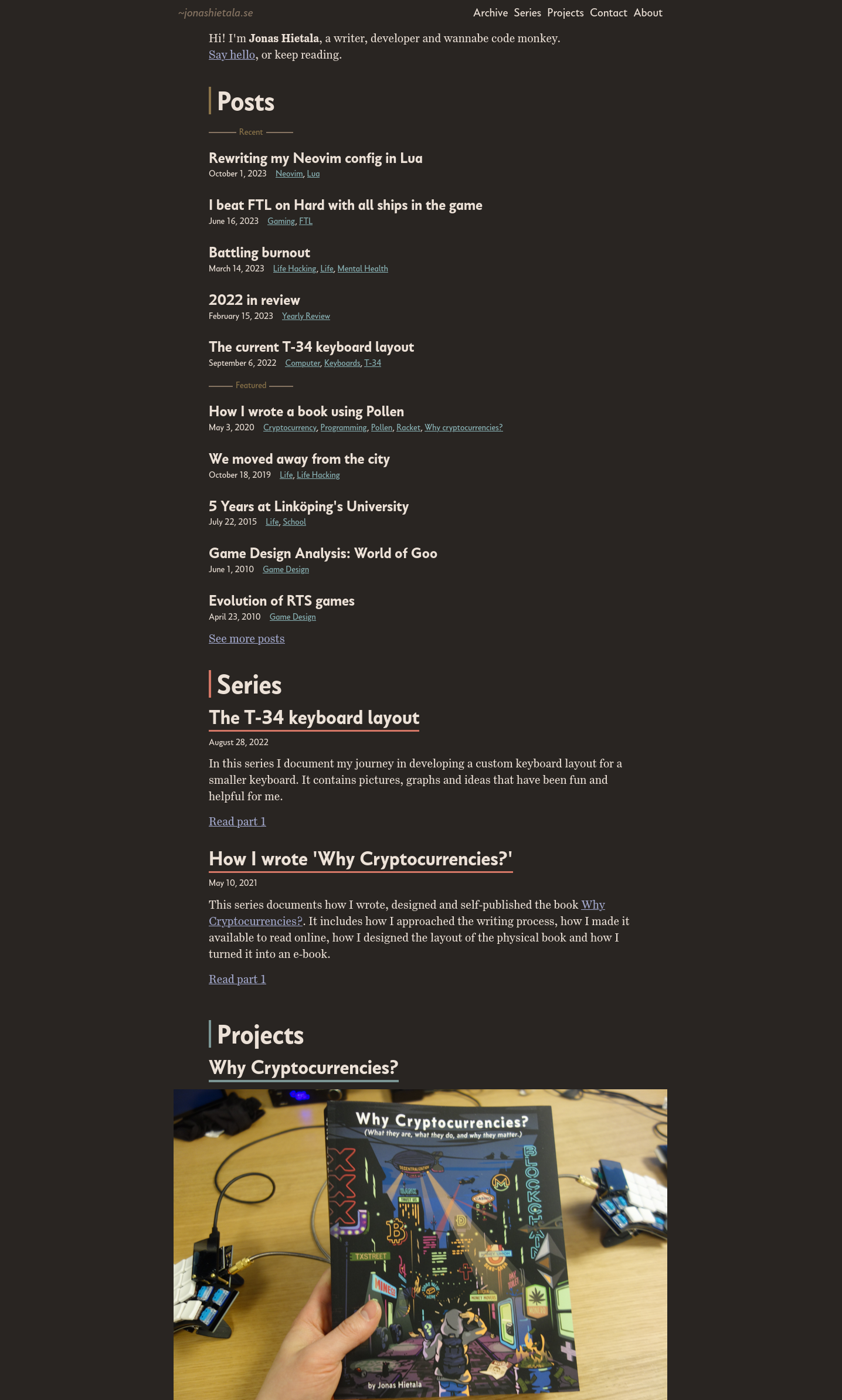
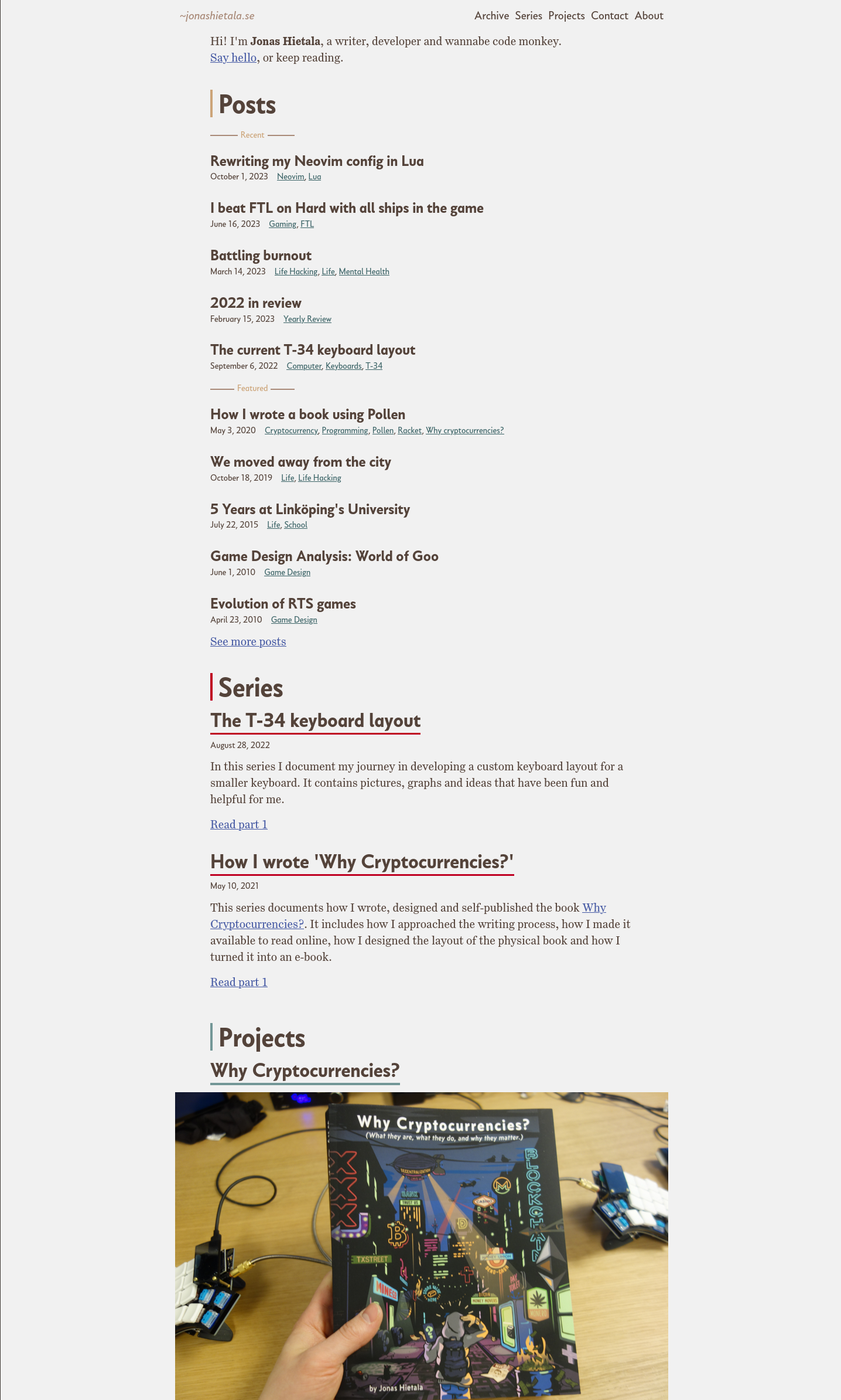
I’m sure you could make a bunch of improvements, but the design fulfills my goals at least.
Automatic dark mode
I’ve been using dark mode when coding for ages, but it’s only recently I tried to switch everything to dark by default.
Some sites use a dark mode switcher button, but I think it’s better if the sites detect your preference automatically. It’s surprisingly easy in CSS using prefers-color-scheme, and here’s a small example:
{
}
{
}
}
// Then you just use the variables like so:
{
}
To test this out, in Firefox (and I’m sure other browsers) you can change your preference and the site will update immediately:
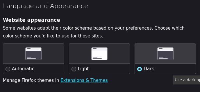
I prefer the dark variant, but the light is also quite nice.
New colorscheme
I recently fell in love with the colorscheme melange-nvim for Neovim. This was a big deal for me so naturally I want to use the colorscheme everywhere.
This doesn’t just apply to the code highlighting, but to the colorscheme of the entire blog itself. Go big or go home.
Systematic CSS
People love to hate on CSS, and maybe I’m damaged but I quite like CSS. Things have come a long way since I styled my first webpage. Back then you had to do all types of weird incantations even to do simple things, and IE 6 still found a way to mess it up.
While there are browser incompatibilities today, it’s not nearly as bad and the browsers today support a lot of really nice features that makes modern CSS quite neat.
Here are some things I utilized this time around:
Fluid size scales
Sizing fonts is more annoying than one might think. One thing you’d like to do is to have a slightly larger font for larger screens, and smaller sizes for smaller screens (such as your phone). It makes it easier to read on both devices, but it’s a bit annoying to setup.
Previously I used media queries, but a neater solution is fluid size scales. I just used some generator I found online and it seems to work well:
// From https://www.fluid-type-scale.com/
{
}
Now it’s not perfect, and on my monitor I feel the jump from m to s is a bit too big, but this is good enough (for now).
I also utilize a fluid scale for spacing:
// From https://utopia.fyi/
{
}
Lobotomized owl
It’s always fun to find weird things that are also very useful. The lobotimized owl selector is just that.
// Hoot-hoot
For a great explanation see My favourite 3 lines of CSS, but in short it enables you to set consistent spacing between child elements.
It’s super useful, and I use this mixin for it:
{
{
{
}
}
}
Why didn’t I use the stack + flow as described in the linked blog post? Honestly, I had forgot about it and only searched for the post now as I’m writing this. Their way is probably better, but I can’t be bothered to refactor it right now. 🤷
Measure to limit text width
A big readability tip is to limit the line length to 45–90 characters.
I do this using max-inline-size and a variable to control the length that’s on by default:
{
// Measure limits the width of text to be more readable.
}
{
// Limit everything to --measure by default.
}
// Opt-out instead of opt-in, makes it a bit more manageable honestly.
body,
div,
header,
nav,
main,
footer,
pre code,
pre {
}
If I want to use a different line length I can just alter --measure, or override max-inline-size if I don’t want it for some elements.
CSS Grid is awesome
I haven’t used grid that much previously, but it’s one of these newer features that makes CSS a pleasure rather than a pain to work with. You can accomplish things that were previously hard to do with just some commands. Here are some examples of how I use grid:
Image gallery: 3-column layout
{
}
Tags: variable number of columns
If you want to fit as many columns as possible, you can use this setup that I use on the tags page:
{
}
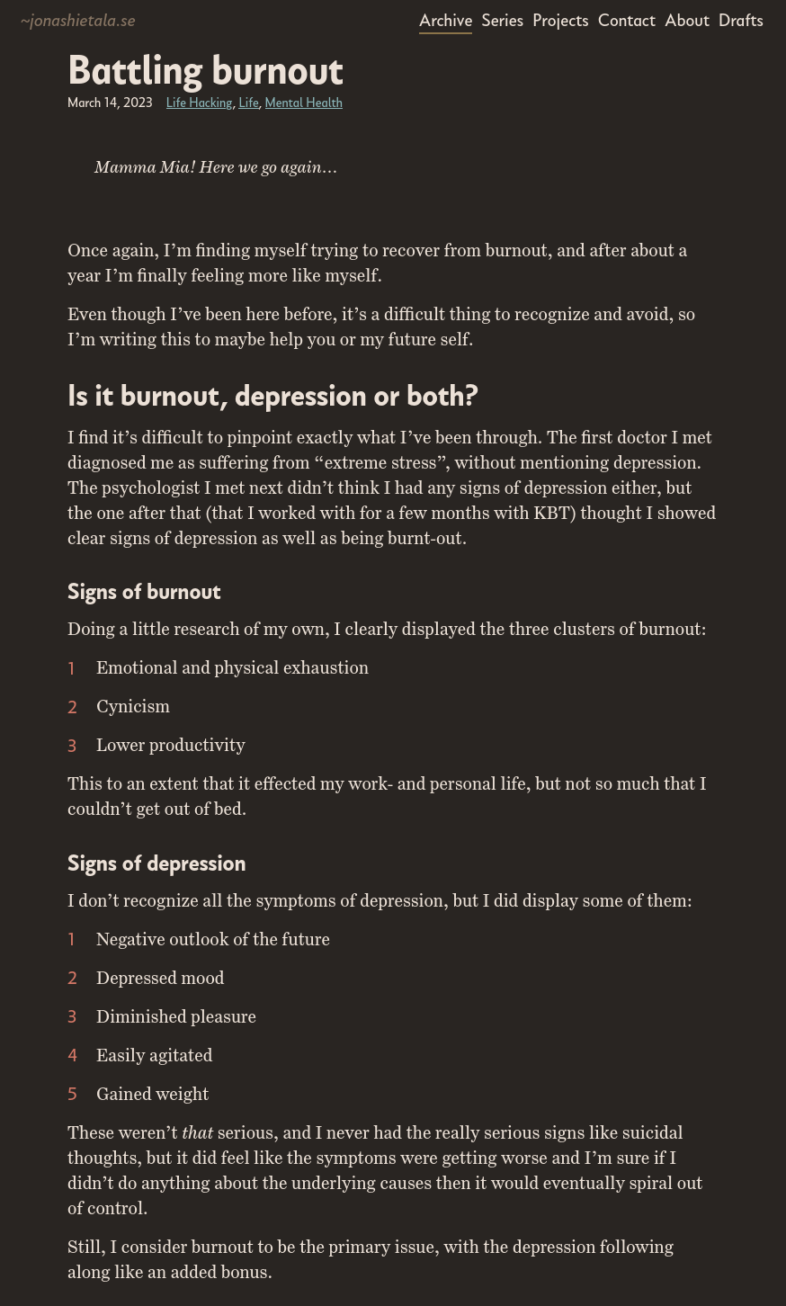
Post: overflow images and code blocks
Constraining the width of text is good, but I wanted to allow images and code blocks to extend past that a little if needed. See this image:
In my previous design I used media queries and relative offsets to accomplish it, but with grid it’s easier and fluent. With this setup you can also allow an image to extend the entire screen (“full bleed”), but so far I haven’t find a use for it.
The main article includes this wrapper:
{
;
// Place all content in the main content area by default
{
}
}
This sets up 5 areas: the main middle content, constrained by --measure, the overflow with --overflow-size and the rest.
On narrow screens everything except the content collapses to zero width.
Then you override grid-column for the items you want to overflow:
// For overflowing the article.
{
// This resets the --measure constrain I have on by default.
}
// For items that should span the entire screen.
{
}
Mixins like these are why I prefer sass over raw CSS, it makes creating these systems more practical and maintainable.
What am I not satisfied with?
I quite like sitting and making small tweaks until I like how things look. Even if the process can be slow I still enjoy it.
But I really don’t like how brittle it feels.
I’ve tried to namespace rules, so in css/local/_tags.scss I have rules only for the tags page:
{
{
// ...
}
}
But most things are shared across pages, and if I make a change somewhere I may accidentally break some obscure styling somewhere. Having unit tests for the layout would be nice, but I’m not keen of maintaining a rendering of all pages and doing an image diff to find errors.
Of course I could make everything local, but then I’d miss out on the usefulness of the general rules, and the maintenance burden would be even higher.
Maybe I’ll just leave the styling alone for the next couple of years until I feel I want to remake everything again?