Designing a personal Pebble watchface ★
I recently got a Pebble Time 2 as it seemed like a fun smartwatch away from Google/Apple/Samsung with a good 4 weeks of battery life. One thing I wanted to do is to create a custom watchface for my specific problems.
It took more effort to design the watch than I had anticipated and there’s a deceptively large amount of thought that has gone into some of the features here, so I thought it’d be interesting to write a little about it.
Issues I want the watch to help me with
It’s difficult to describe what I’ve been going through the last ~6 months. It started with a normal depression (yeah, a “normal depression” says a lot already) but it was followed by what felt like a big increase in volume; manageable issues I’ve had forever were suddenly overpowering.
I’ve always found it difficult to start chores and boring tasks, yet now it felt like trying to swim through quicksand.
At the same time I had huge problems with hyper focus. I could start working on something and the entire day would just disappear; I would sit in front of the computer for 8 hours without any break, interrupted by having to go get my kids from school and I realize that my bladder is exploding and I hadn’t eaten lunch yet. Then I would spend the rest of the day thinking about it, even having difficulty falling asleep because I’m still thinking about it.
Needless to say, my time management has gone out the window, even missing appointments for the first time ever.
Of course, a watchface won’t solve any of these but I’m desperate and nothing I’m trying is helping. Concretely I’d like the watch to help me with these things:
- Give an overview of today’s calendar.
- Getting started with tasks.
- Alerts to break hyper focus.
I was going to name the watchface “ADHD hero” but that was a little on the nose as I don’t have an ADHD diagnosis (yet… The investigation is under way but it’s not a quick process).
A watchface only for me
I like open source but I don’t have any plans of publishing the watchface. The entire point of the watchface is to remove friction in my life, not create another source of anxiety. This way I’m free to change it, rewrite it, pollute it with vibes, and I can focus on making it just good enough for me without having to worry about others.
I encourage you to steal anything you like and create your own watchface; it’s straightforward with Pebble.
Prototyping with Claude
I’m a big believer in being able to quickly iterate through different prototypes. I’ve had success with using Claude to generate HTML prototypes and it can spit out images like this:
Design-wise it’s hit-and-miss and Claude seems to lack creativity and taste (but sometimes it comes up with great ideas). You need to guide it properly and I’ve gotten good usage from telling it to generate dozens of variations of a concept and iterating from there. All images in this post are generated in this way at various points of the development.
It can also quickly generate interactive prototypes, like this embedded widget that simulates (almost) the entire watchface and its features:
Battery
This is super useful and I’ve used it to fine tune the wedge geometry, color scheme, a chiptune library, and more.
Finding a style
The design of the watchface started before I had the watch and before I wrote a line of code. Initially the feel was very different; it was a cleaner, more uniform, design without as much clutter and everything followed a consistent design language.
I just knew that it was perfect.
When the watch arrived I built it and it sucked. It was so boring…
I saw the Comic Drop watchface and its comic book panel layout is really interesting. Wouldn’t it be cool to have a similar comic book panel layout that would show the events during the day? Maybe they could be dynamic and move around during the day?
It would be really neat to have some pixel graphics of a computer during the morning when I should work, a picture of a barbell when I should exercise, etc. Unfortunately that’s beyond my skill level at the moment so I had to give up that idea.
So I went back to the original design but iterated on a “comic book” style with thicker lines, brighter colors, and more irregularities:
This is a more interesting watchface and it looks much better on the wrist than the first iteration. Not perfect of course but it catches my interest, which is the point.
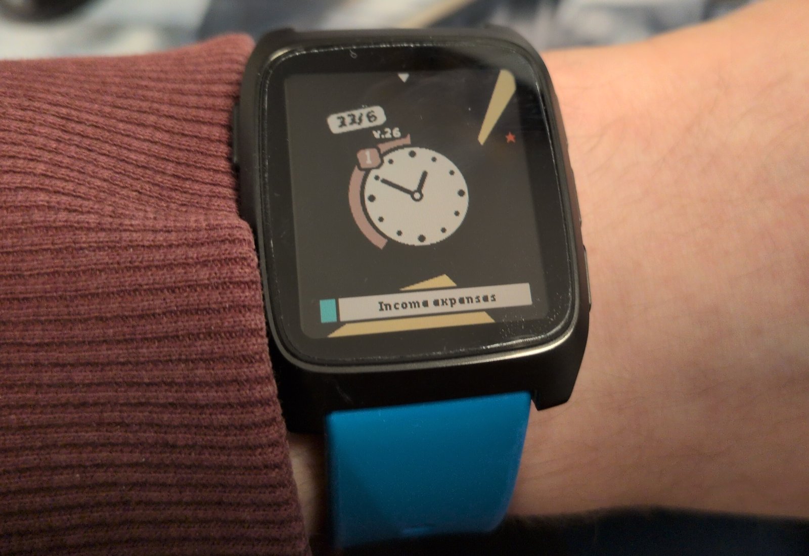
Calendar overview
I want to be able to glance at the watch to see my calendar. Watchfaces such as the Sectograph add event information inside the clock (so an event between 1 and 2 would colorize the section of the analog clock) and I wanted something similar.
Here are some prototypes to give you an idea of what I’m talking about:
This should hopefully make it easier for me to be able to plan my day a little better.
A notable omission in my design is the lack of a text description of the event. That’s nice but it also clutters the design I’m going for. The important thing for me isn’t what the event is, it’s “is there an event at all”.
Non-uniformity
My brain is very good at filtering away static and uninteresting information. For example, I’ve tried to have Calendar, Habitica, and Todoist widgets on my phone to help me keep track of my events/habits/tasks… But it didn’t take long for my brain to start completely ignoring them despite them taking up 80% of the screen. When I say ignore I mean that literally: I completely stopped noticing them.
So what I wanted to try was to spice it up a little by randomizing the event geometry. See these two examples:
To me the non-uniform prototype is more visually interesting and the changing geometry should hopefully prevent me from filtering them out.
You can argue that the rounder uniform version would look better on the Pebble Round 2, which is fair. Here’s a similar mockup but with the round’s geometry:
I still think the non-uniform variant catches the eye more and solves my specific problem a bit better but there’s no denying that a round layout on a round watch fits very well.
Moving towards 12 o’clock
Another idea I had was instead of statically fixing events to their times I wanted the events to move towards “now” at 12 o’clock. So an event that renders at 3 o’clock is 3 hours away and an event that overlaps 12 is ongoing.
While this prevents me from easily looking back at my day (past events disappear) it makes it easier to feel the urgency as events draw closer. A bit weird perhaps but in practice it feels great.
Here’s the same event through its lifecycle: drifting in from 3 o’clock, ongoing as it crosses 12 (with the countdown band draining in the clock), then gone once it’s in the past.
Something like this:
Completion countdown
This works pretty well but there’s a problem: how to differentiate between an event that will start in one minute and that has been going on for a while? Because the event gets cut off at 12 there’s no way to tell at a glance.
At first I tried to enlarge the event wedge so it touches the clock if it’s ongoing. That was a bit weird so instead I tried to colorize the clock outline with the event that’s ongoing. Then I realized, why not have the outline count down the remaining time of the event, similar to a Time Timer?
In practice this works out wonderfully well.
Work timer
I quite like the completion countdown for calendar events. This kind of design is often associated with tracking tasks (such as in Pomodoro) so why not add it to the watch too?
For example, I might want to configure a stretch of 60 min work / 15 min break / 60 min work before I should stop working. Pretty standard stuff. As I’m struggling to get started I’ll add a twist: a working block should have a 5-minute warm-up period. So the timeline looks like this:
I think it makes sense to have that one count down (from filled to empty) while the working block counts up (from empty to filled), like so:
Starting/stopping timers on a Pebble watchface
This is a post about design, not about implementation, but I still need to address how we can implement a work timer toggle.
The issue is that a Pebble watchface is a background process that cannot interact with Pebble’s physical buttons. You can bind the buttons to quick launch Pebble apps but not watchfaces. A watchface can detect steps and taps on the watch but it cannot communicate with other apps.
There’s a few ways to get around this:
-
Toggle using taps only.
-
Implement it as a Pebble app, not a watchface.
-
Add a new Pebble app (tied to a button) that round trips commands via the companion app back to the watchface.
I first tried to implement toggling using taps but it was too unreliable. If I went the app route I’d have to relaunch it all the time, which represents unacceptable friction. What’s left is the janky phone round trip solution.
I already need a companion app for the calendar sync but it still makes me queasy.
Clearing alarms and forcing breaks
I’ve tried alarms, Pomodoro, and similar before but they all share the same failure mode: I simply ignore the alarm and continue with what I was doing.
A Pomodoro can’t be interrupted; it marks 25 minutes of pure work.
I don’t know, it could be 2 minutes just as likely as 200 minutes.
So I figured I’ll try to force myself to take breaks by making it annoying to clear (a bit like the Hand Grenade Alarm clock but in wrist form). The watchface can vibrate, play sound, react to steps, and detect taps and this is the flow I came up with:
- An alarm fires when I should stop working
- I first need to walk +20 steps before I can clear it
- When that’s done I can dismiss it by tapping on the watch a bunch of times
The alarm transforms the screen and vibrates and plays a tune until it’s dismissed (repeats every 30 seconds).
Visually the required steps are drawn at the border (no events are shown during an alarm) and the alarm is drawn as a comic-style blast (tapping it shrinks the blast). Like this:
How well does it actually work?
It’s a pretty cool setup and it is helping but it still fails quite often.
Most of the time I forget to start the work timer and other times I’m able to add enough steps by waving my hand around like a crazy person, and then continue working. (If I raise the step count then it gets annoying to dismiss when I’m actually walking.)
Could be tuned better I suppose.
Other types of alarms
Visually there are some distinct alarms I use:
- Pause (signals the start of a short break between two working blocks)
- Stop (signals the end of all working blocks)
- End of day (working day completely over)
- Manual alarm (just a normal fire-once alarm without dismissal)
I’ve separated them visually and they each use unique vibrations and tunes.
Other information
I’ve previously used watchfaces overloaded with all kinds of information and graphs that were cool for a few minutes and then I never looked at them again. But there are some things I regularly glance at such as the date or if the watch has lost its phone connection.
Date and week number
Here are some prototypes for dates that I liked but ultimately discarded:
The difficulty is to not crowd the watchface too much with the date and the other elements I’ll get to later.
In the end I ended up with a simple 31/10 label and a small weekly text without background as I don’t look at the week number that often:
I’m not completely sold on the week number display (yellow labels were a lot more fun) but it’s good enough I guess.
Step counter
It was really difficult for me to find a step counter design I liked. Everything I tried just felt off. Here are three of my attempts:
I used to track steps at the edges for most of the design (you can see the step elements in many of the prototype images in this post) but in the end it introduced a bit too much clutter for my taste. While the other two attempts above are crude and could be polished more I didn’t see potential in them. (Examining and cutting away branches is important during design I think.)
And then the revelation: I don’t care about the exact step count. The only purpose of showing steps is to help me keep the step count up, so I’m not sitting in front of the computer all day, and having badges for tiers solves that problem even better.
Here are the badges I use:
Bronze is achieved at 33% of my daily goal, silver at 66%, gold at 100%, and diamond is for over-achieving with 150%. I feel that having an easy to reach tier helps me do something on the lazy days and the hard-to-reach tier helps give me an extra kick the days I’m out and about.
Yes, not knowing exactly how much is left to the next tier is slightly annoying, but for those cases opening up the Health app on the watch to view the step count is good enough.
Battery states
High after the rush of figuring out how to display steps let’s use the same approach for battery warnings:
Yes, I probably should make the little battery interactive or something but this is a 80:20 situation: I get 80% of the benefit from 20% of the effort. It’s good enough.
Bluetooth & Sleep / DND
More badges!
Pebble has a “Quiet Time” mode that silences notifications. This is a separate thing from Android’s sleep mode or do-not-disturb mode. As I have a companion app I can detect the Android state and the watchface combines the two (and silences task alarms for instance) while also showing a “sleep” bubble so I can see these invisible states.
The next task
I’m a big fan of some of the ideas of Getting Things Done such as the idea of the “next task”: the one actionable thing that you should do next.
I’ve used the Todoist Android widget on my phone to display my tasks but I wanted to incorporate it into my watch too. The idea is to only display the next task, something like this:
While I think all three prototypes above are visually pleasing I went with the wider display that takes up less vertical space:
As a bonus I don’t have to mess around with rendering angled text.
Completing/rescheduling the task
It works fairly well but there’s a wrinkle: when I’ve done the task or realize I can’t do it now I have to pull up my phone and that’s annoying so in practice I’m leaving a stale task alone forever, priming my brain to ignore it.
I’ve tried the Todoist Mini app on the Pebble but there’s so many clicks to find the task and complete or reschedule it.
What I did was add it to the app I’m already using to toggle the work timer and give it a menu of options:
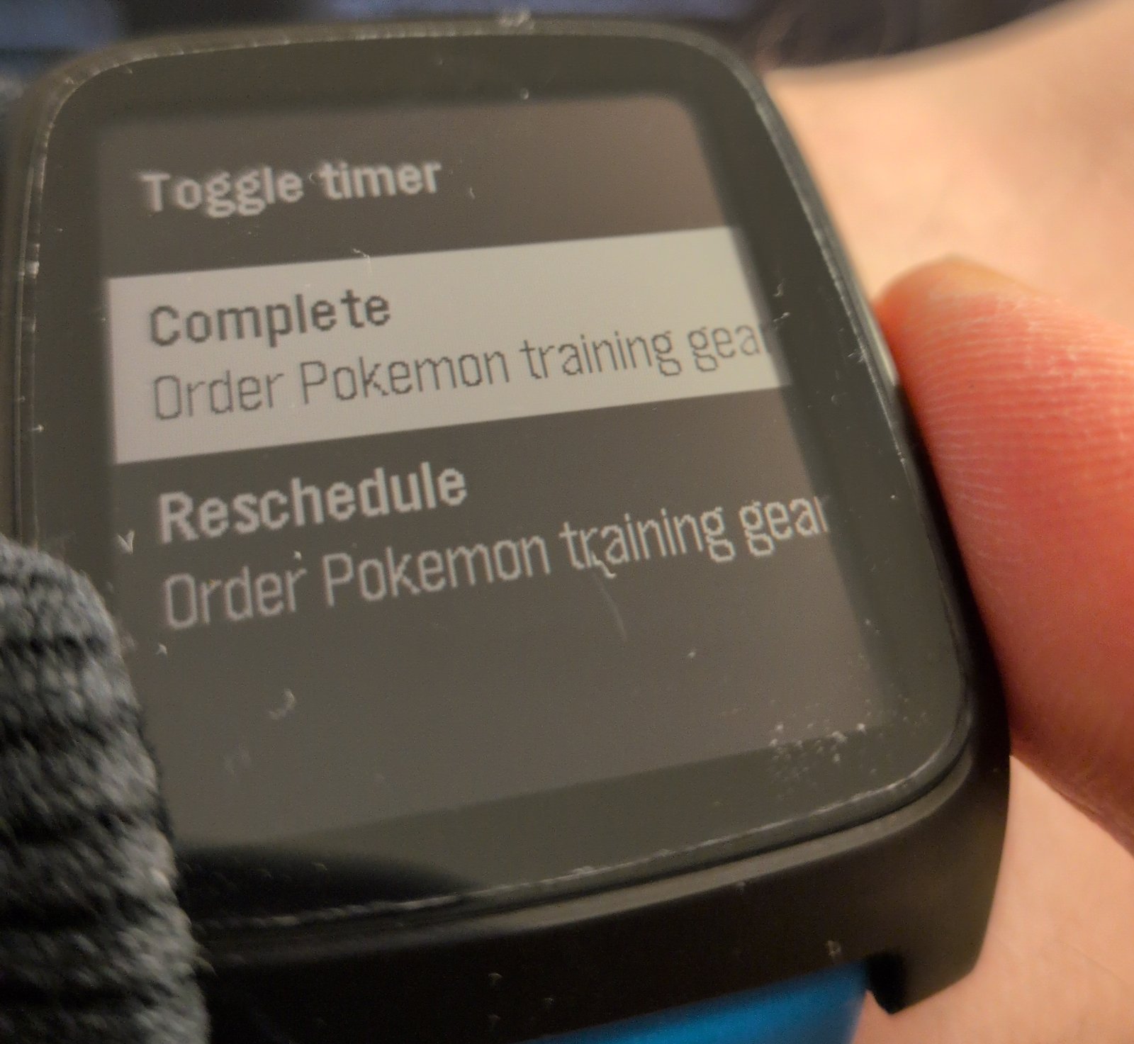
I can still toggle the work timer, complete the next task, or reschedule the task (it’s rescheduled for tomorrow).
I’ve bound it to the UP button via “quick launch”. To keep toggling the work timer as simple as possible pressing UP again toggles the timer (so double clicking UP when the watchface is visible toggles the timer). Otherwise it uses the standard Pebble control scheme (UP/DOWN to select and SEL to execute) and the app closes and returns to the watch when an item is selected.
So far it’s been working really well but as has always been the case before with these productivity “fixes”; I always tire of them eventually.
Edge markers
As a little extra I added some markers to track other types of things along the edges:
The colored dots for calendar events are genuinely useful as many events require some preparation/travel time. In these cases I add a reminder for the event at, say, 15 minutes before. With the dots this preparation time can now also be seen by glancing at the watch (Pebble natively shows reminder alerts anyway.)
The end of day marker is also useful for when I’m planning my working day but sunrise / sunset is mostly a gimmick, and I don’t use the manual alarms .
The end result
At the end I got an interesting watchface I think looks fun and that helps me go about my day. It’s pretty easy to make one, and if you don’t know where to begin LLMs can shorten the time to get up and running.